Spinoko Navigation Menus
Spinoko has multiple navigation menus and you can even add one on your own. Learn more and how to do that below.
Navigation Menus
By default Spinoko has 2 navigation menus:
- Header navigation
- Footer navigation
However, you can add an additional nav menu to the site header if you want.
💁 since version 2.4.0
you don't need to install a child theme for additional navigation, just check the box for Customizer -> Miscellaneous Options -> Display Traditional Menu option.
Header Navigation
Header navigation is the primary navigation menu of the theme and it's a hamburger menu, by default closed on all screens regardless of the screen size.
Footer Navigation
Footer navigation is an optional navigation menu and it's right above the copyright text in the theme footer area.
Additional Navigation
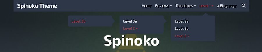
💁 since version 2.4.0
you don't need to install a child theme for additional navigation, just check the box for Customizer -> Miscellaneous Options -> Display Traditional Menu option.
If you for some reason want to have a traditional navigation menu on site header you can do so following the steps below. This is what it looks like:
You can either download a child theme that already contains all the code you need or you can follow along to add changes manually if you already have a child theme installed.
🔽 Download the child theme
Download the child theme containing all the changes you need to add the additional nav menu here.
Just rename the folder spinoko-child-master
to spinoko-child
and upload it to your WordPress server wp-content/themes
directory. Learn more about using child themes.
👩💻 Adding changes manually
We're going to use a child theme to add our functions and styles, so I assume you have a child theme installed and it included the below files:
spinoko-child/
|- functions.php
|- style.css
Step 1️: Adding nav related functions
Create a new file in the child theme root directory called spinoko-additional-navigation.php
and paste this into it:
<?php
/**
* Spinoko additional navigation.
*
* @package Spinoko Child
*/
if ( ! function_exists( 'spinoko_register_additional_nav_menu' ) ) {
/**
* Register additional nav menu.
*
* @return void
*/
function spinoko_register_additional_nav_menu() {
register_nav_menus( array(
'menu-additional' => esc_html__( 'Additional', 'spinoko' ),
) );
}
add_action( 'after_setup_theme', 'spinoko_register_additional_nav_menu' );
}
if ( ! function_exists( 'spinoko_display_additional_nav_menu' ) ) {
/**
* Display the additional nav menu.
*
* @return void
*/
function spinoko_display_additional_nav_menu() {
?>
<nav class="additional-navigation">
<?php
wp_nav_menu( array(
'theme_location' => 'menu-additional',
'menu_id' => 'additional-menu',
'menu_class' => 'additional-menu flex items-center justify-end px-4',
) );
?>
</nav>
<?php
}
add_action( 'spinoko_header', 'spinoko_display_additional_nav_menu', 12 );
}
The first function spinoko_register_additional_nav_menu
registers the nav menu and the second one spinoko_display_additional_nav_menu
makes it display before the search icon on the site header using theme hooks. I don't think you need to change anything there.
Step 2️: Adding nav menu styles
Let's add styles. Open your style.css
file and append the below styles to it. Looks like a lot of stuff, but don't wprry, explanations are below.
/** ADDITIONAL NAVIGATION **/
.additional-menu {
/**
* 💁 adjust colors below, use any color value
* or leave unchanged for default values
**/
--color-links: var(--color-light);
--color-links-hover: var(--color-link);
--color-submenu-bg: var(--color-dark);
/**
* 💁 use inline-block to enable icons next to parent menu items
* or none to disable it, no quotes
**/
--icon-display: inline-block;
display: none;
}
.site-header .site-search {
padding-right: 1rem;
}
@media (min-width: 1024px) {
.additional-menu {
display: flex;
}
/**
* 💁 remove 2 below rules if you want to keep main (hamburger) navigation
* with the additional one on large screens
**/
.main-navigation {
display: none;
}
.site-header .site-search {
padding-right: 0;
}
}
.additional-menu>li {
position: relative;
padding: 0 0.5rem;
}
.additional-menu li a {
color: var(--color-links);
transition: all .3s ease-in-out;
}
.additional-menu li:hover>a,
.additional-menu li a:hover {
color: var(--color-links-hover);
}
.additional-menu ul {
position: absolute;
top: calc(100% + 2rem);
right: 9999rem;
width: 12rem;
z-index: 1;
opacity: 0;
padding: 0.5rem 0;
background: var(--color-submenu-bg);
border-radius: 0.4rem;
transform: translateY(0.6rem);
transition: opacity 0.15s linear, transform 0.15s linear, right 0s 0.15s;
}
.additional-menu li.menu-item-has-children:hover>ul,
.additional-menu li.menu-item-has-children:focus>ul {
right: 0;
opacity: 1;
transform: translateY(0);
transition: opacity 0.15s linear, transform 0.15s linear;
}
.additional-menu ul::before,
.additional-menu ul::after {
content: "";
display: block;
position: absolute;
bottom: 100%;
}
.additional-menu ul::before {
height: 2rem;
left: 0;
right: 0;
}
.additional-menu ul::after {
border: 0.8rem solid transparent;
border-bottom-color: var(--color-submenu-bg);
right: 1.8rem;
}
.additional-menu ul a {
display: block;
width: 100%;
padding: .25rem 1rem;
color: inherit;
}
.additional-menu ul li.menu-item-has-children>a {
padding-right: 4.5rem;
}
.additional-menu li.menu-item-has-children>a:after {
content: '';
display: var(--icon-display);
width: 0.25rem;
margin-left: 0.25rem;
padding-bottom: 2px;
border-top: 0.25rem solid var(--color-links);
border-bottom: 0 none;
border-right: 0.25rem solid transparent;
border-left: 0.25rem solid transparent;
transition: border 0.15s ease-in-out;
}
.additional-menu li.menu-item-has-children:hover>a:after {
border-top-color: var(--color-links-hover);
}
.additional-menu ul ul {
top: 0;
}
.additional-menu ul li.menu-item-has-children:hover>ul,
.additional-menu ul li.menu-item-has-children:focus>ul {
right: calc(100% + 2rem);
}
.additional-menu ul ul::before {
top: 0;
bottom: 0;
right: -2rem;
left: auto;
width: 2rem;
height: auto;
}
.additional-menu ul ul::after {
top: 0.75rem;
bottom: auto;
right: -1.6rem;
border-bottom-color: transparent;
border-left-color: var(--color-submenu-bg);
}
You can adjust any styles the way you want if you're familiar with CSS. But even if not, there are 3 main places where you can easily change stuff, look for this icon 💁 in styles.css
. Here's what they do:
- You can adjust link colors and sub menu background color by just adding the color values. If you're happy with the defaults, just leave them as they are:
/**
* 💁 adjust colors below, use any color value
* or leave unchanged for default values
**/
--color-links: var(--color-light);
--color-links-hover: var(--color-link);
--color-submenu-bg: var(--color-dark);
This is if I wanted to change them:
--color-links: green; /** now the links will be green **/
--color-links-hover: var(--color-link); /** this one I decided not to change **/
--color-submenu-bg: #000; /** and sub menus should be black **/
- You can display small "icons" next to menu items that have sub menus.
By default it is set to display, change
inline-block
tonone
to disable them
/**
* 💁 use inline-block to enable icons next to parent menu items
* or none to disable it, no quotes
**/
--icon-display: inline-block;
If I wanted to disable them:
--icon-display: none;
- You can still display the main hamburger menu along with this new one. To do so you need to remove the following rules/lines.
/**
* 💁 remove 2 below rules if you want to keep main (hamburger) navigation
* with the additional one on large screens
**/
.main-navigation {
display: none;
}
.site-header .site-search {
padding-right: 0;
}
Once you're done with style changes, save the file and let's move on.
Step 3: Include the nav functions file
Now that the styles are done let's include the file we created at Step 1. At the end of the functions.php
add the following lines:
/**
* Additional header navigation menu.
*/
require_once get_stylesheet_directory() . '/spinoko-additional-navigation.php';
Step 4: Create Menu in WP
The code related part is over, the nav menu is added to the theme. Now go to Customizer in your WordPress dashboard → Menus and create a new menu (or use an existing one) to add it Additional menu location. Once you're happy with the results, publish the changes and it's done.